# this is a special object, we use for blanks in exercises!
from setup import ___

# here we import verbs like filter, arrange, and mutate from siuba.
# the import * means to import all of siuba's verbs.
from siuba import *

# here we import everything for plotting from plotnine (like ggplot())
from plotnine import *

# here we import the data for the course
# note that rather than using * to get everything, you can name
# specific things to import (like track_features)
from music_top200 import music_top200, track_featuresWrap up
Putting it together
This lesson shows what the beginning of an analysis might look like. Generally, data analysis is done in notebooks, like this one. In a notebook, you can alternate between blocks of code and narrative text.
The first part of an analysis is often importing tools you will need for the analysis. For example, verbs like filter and mutate are imported from siuba.
The imports for this analysis are shown below.
Exercise 1:
For the artist with the top track in Spain, what country has the most streams for one of their tracks?
Note: you may need to write and run code multiple times.
hint
First, find the artist in the top position in Spain. After, can you get only that artists tracks? Once you do that you should be close!
# getting most streamed track for top artist in Spain
(


)()# Note: I would run the pipe with...
# * only the commented out filter first, to get the artist (KAROL G)
# * then, with the uncommented filter and arrange
(music_top200
# >> filter(_.country == "Spain")
>> filter(_.artist == "KAROL G")
>> arrange(-_.streams)
)| country | position | track_name | artist | streams | duration | continent | |
|---|---|---|---|---|---|---|---|
| 8204 | Mexico | 5 | Tusa | KAROL G | 4830583 | 200.96 | Americas |
| 3600 | Spain | 1 | Tusa | KAROL G | 3295893 | 200.96 | Europe |
| 7897 | United States | 98 | Tusa | KAROL G | 2385525 | 200.96 | Americas |
| ... | ... | ... | ... | ... | ... | ... | ... |
| 3563 | Estonia | 164 | Tusa | KAROL G | 4681 | 200.96 | Europe |
| 7265 | Malta | 66 | Tusa | KAROL G | 3732 | 200.96 | Europe |
| 8095 | Cyprus | 96 | Tusa | KAROL G | 2168 | 200.96 | Asia |
40 rows × 7 columns
Exercise 2:
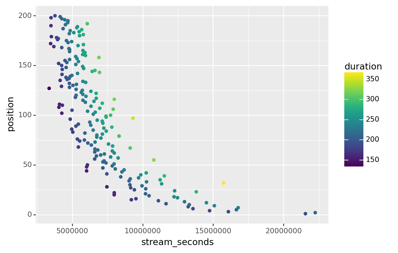
Subset to keep only tracks in Hong Kong, then calculate a new column called stream_seconds, that’s equal to streams times their duration.
Once you’ve done that, try deleting the comments (#) in the code below to plot the data.
(music_top200
  >> ___
  >> ___
  #>> ggplot(aes("stream_seconds", "position", color = "duration"))
  # + geom_point()
)(music_top200
>> filter(_.country == "Hong Kong")
>> mutate(stream_seconds = _.streams * _.duration)
>> ggplot(aes("stream_seconds", "position", color = "duration"))
+ geom_point()
)