from setup import ___

from siuba import *
from plotnine import *

from music_top200 import music_top200, track_featuresFacets
Click here to open the slides full screen.
Exercise 1:
Take a look at plotnine’s documentation for facet_wrap.
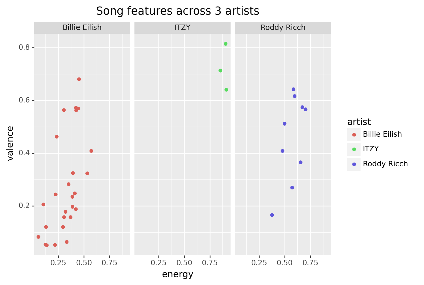
Notice that the Parameters section lists ncol and nrow options. These determine how many columns or rows to use. For example, the plot below has nrow = 1.
Try out the plot as is, and with the nrow argument changed to ncol = 1. Then, answer the questions below.
# This code keeps the 3 artists listed ----
artists_to_keep = ["Billie Eilish", "ITZY", "Roddy Ricch"]

some_artists = (
  track_features
  >> filter(_.artist.isin(artists_to_keep))
)

# This code plots the data ----
(some_artists
  >> ggplot(aes("energy", "valence", color = "artist"))
   + geom_point()
   + facet_wrap("~artist", nrow = 1)
   + labs(title = "Song features across 3 artists")
)
Which of the three artists tends to have the lowest valence?
Billie Eilish
Correct! We’ll discuss how to measure the idea of “tends to have” in the next chapter.ITZY
That’s not right. This artist tends to have the highest valence.Roddy Ricch
That’s not right. Look for the cluster of points toward the bottom of the plot.Which value seems easier to compare across facets, when ncol is set to 1?
answer
This is subjective, but I would say energy is easier to compare, since there is only one x-axis for across all plots. (For example, there is a only one spot on the x-axis where energy is .25).
Exercise 2:
plotnine also has a function called facet_grid. Based on the docs, can you think of a situation where you’d use facet_grid() over facet_wrap()?
Here is a code block to experiment.